Vin Natuur
Natural wine dealer
Project information
View
Hide
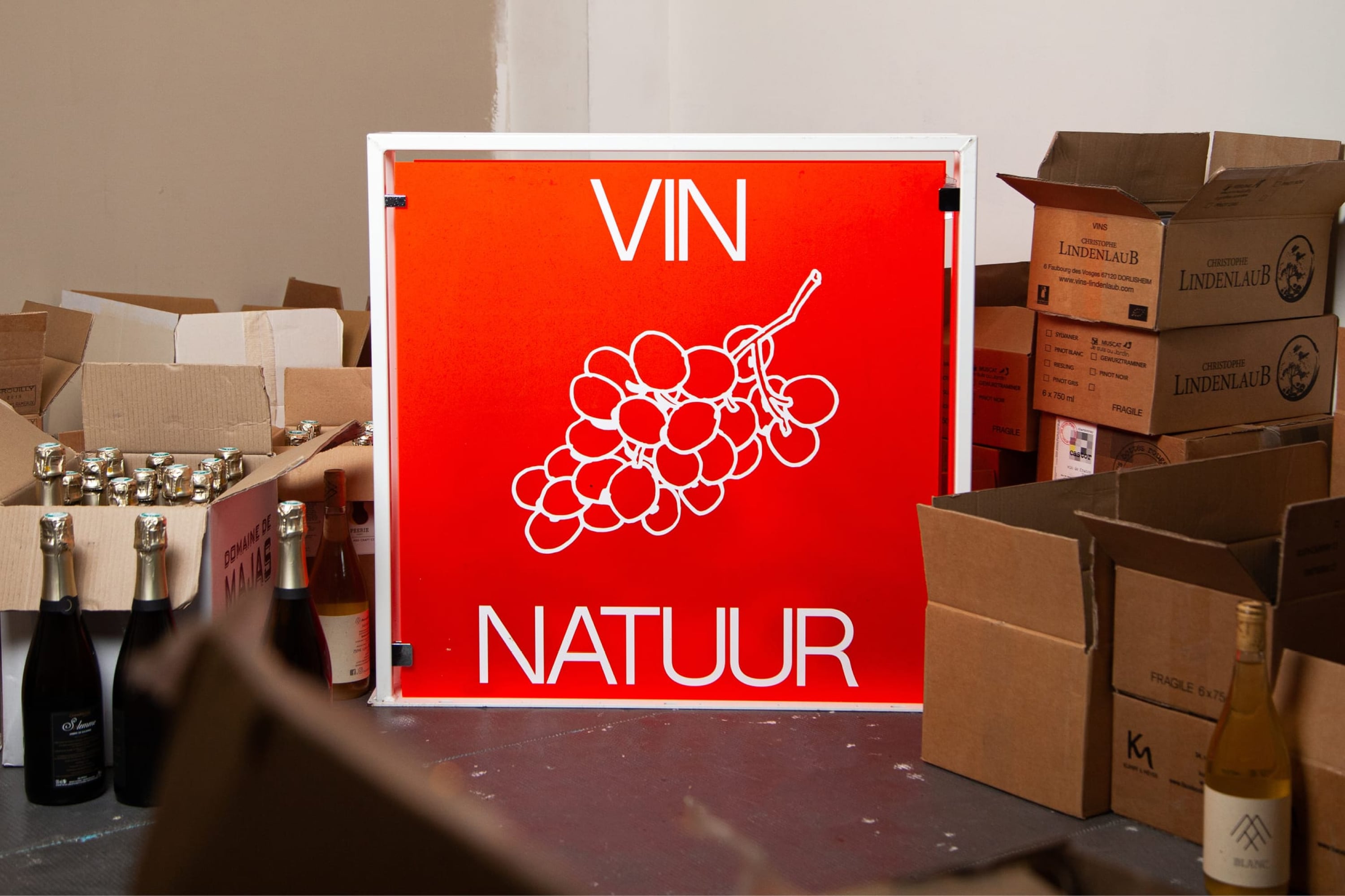
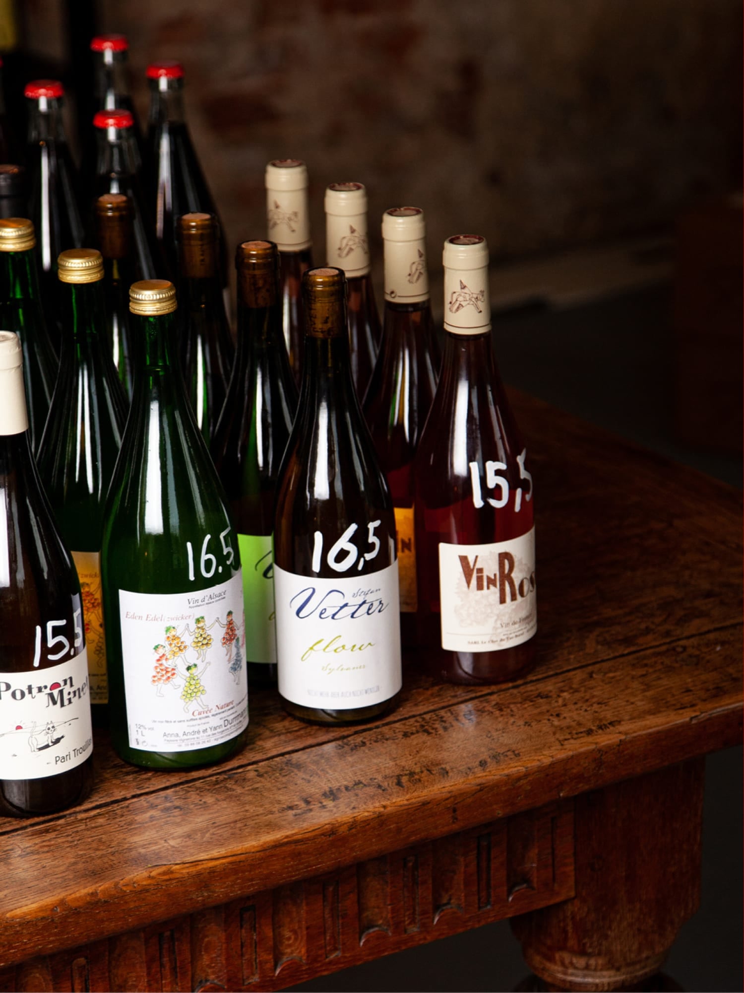
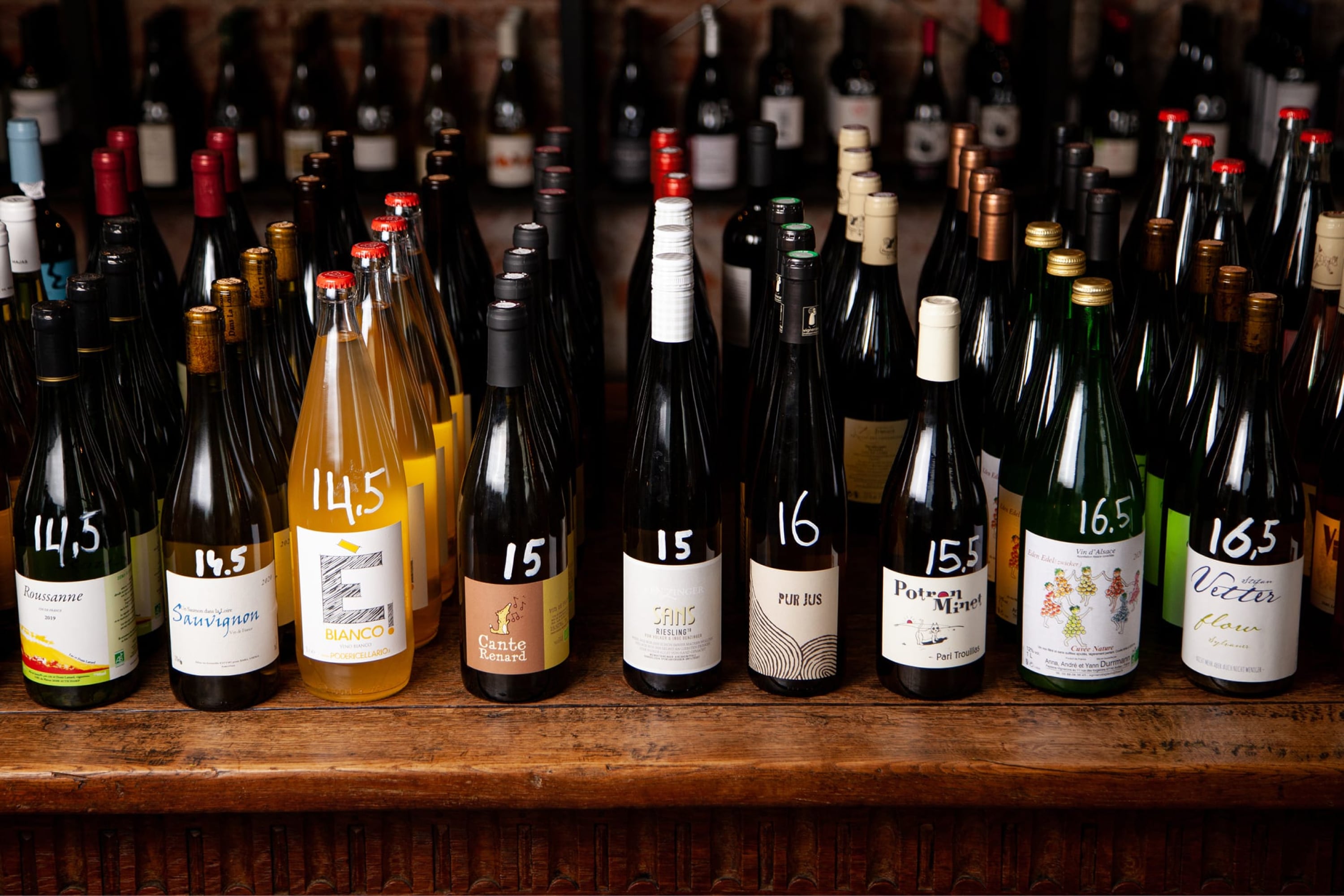
Vin Natuur believes in natural vinification. This means, as little intervention as possible, both in the vineyard and in the wine cellar. To provide a more versatile palette of flavours and scents.
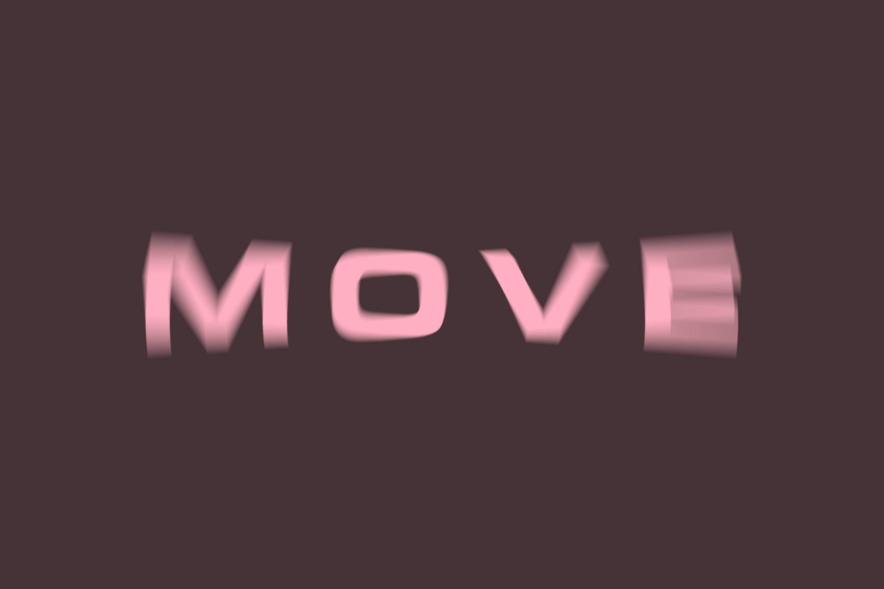
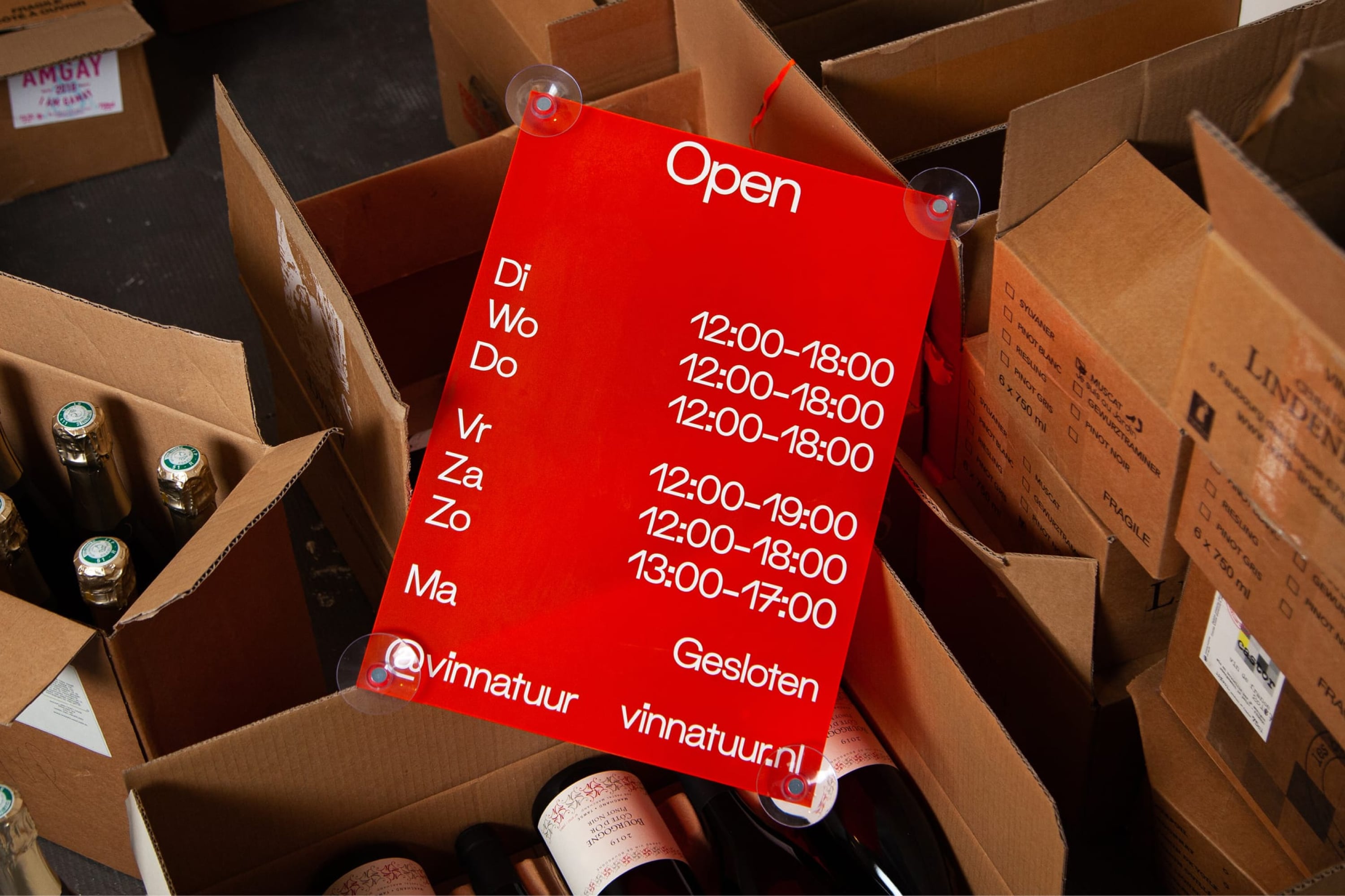
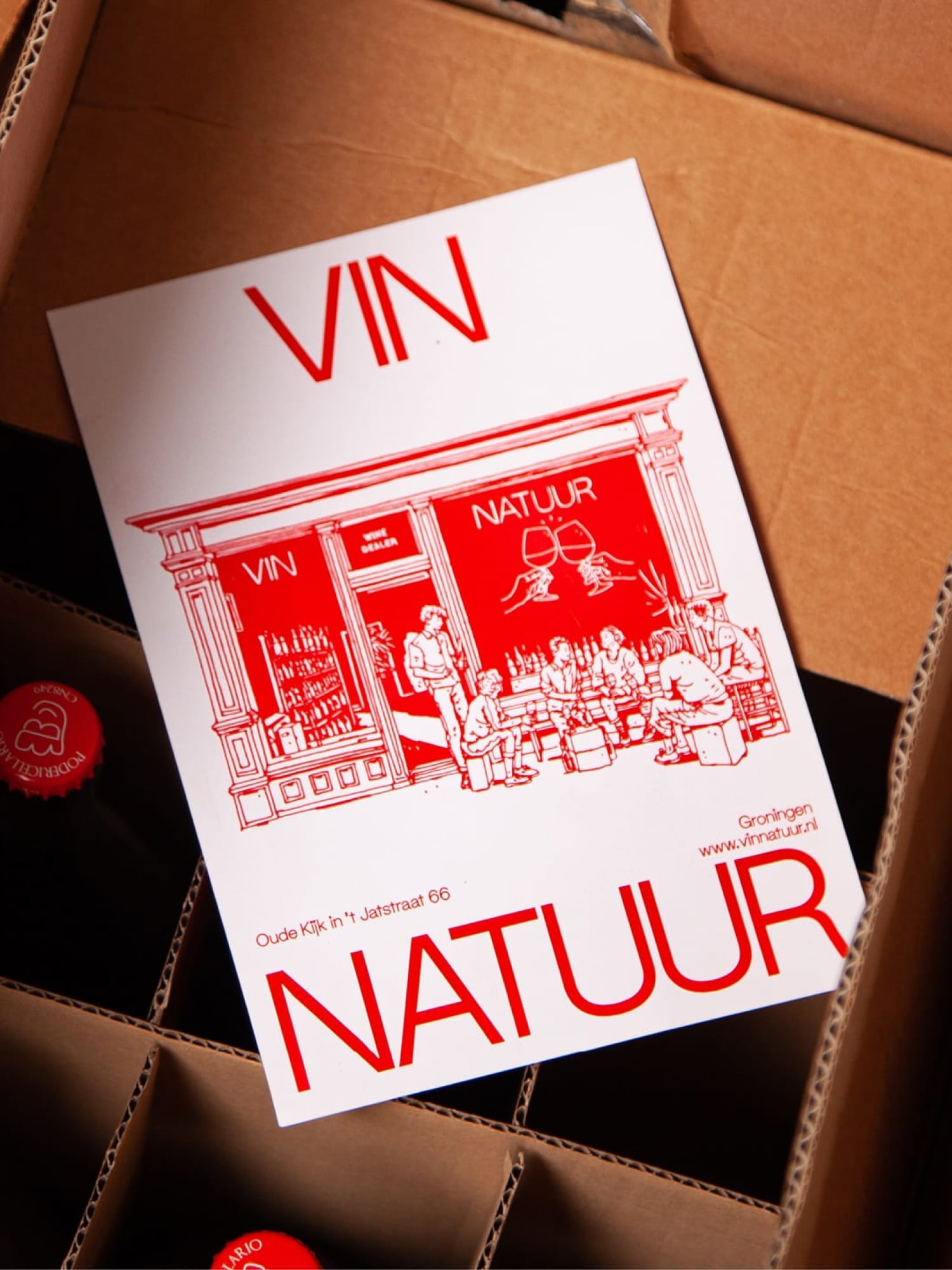
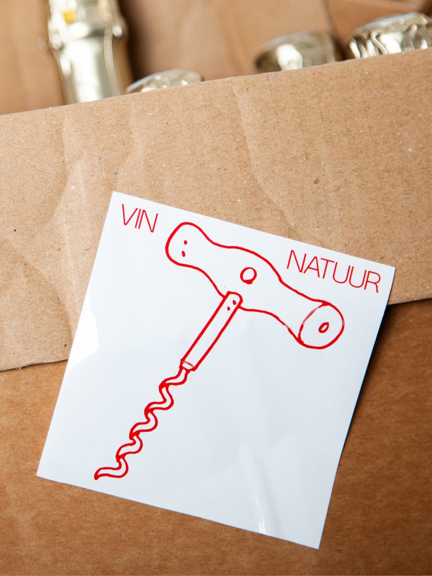
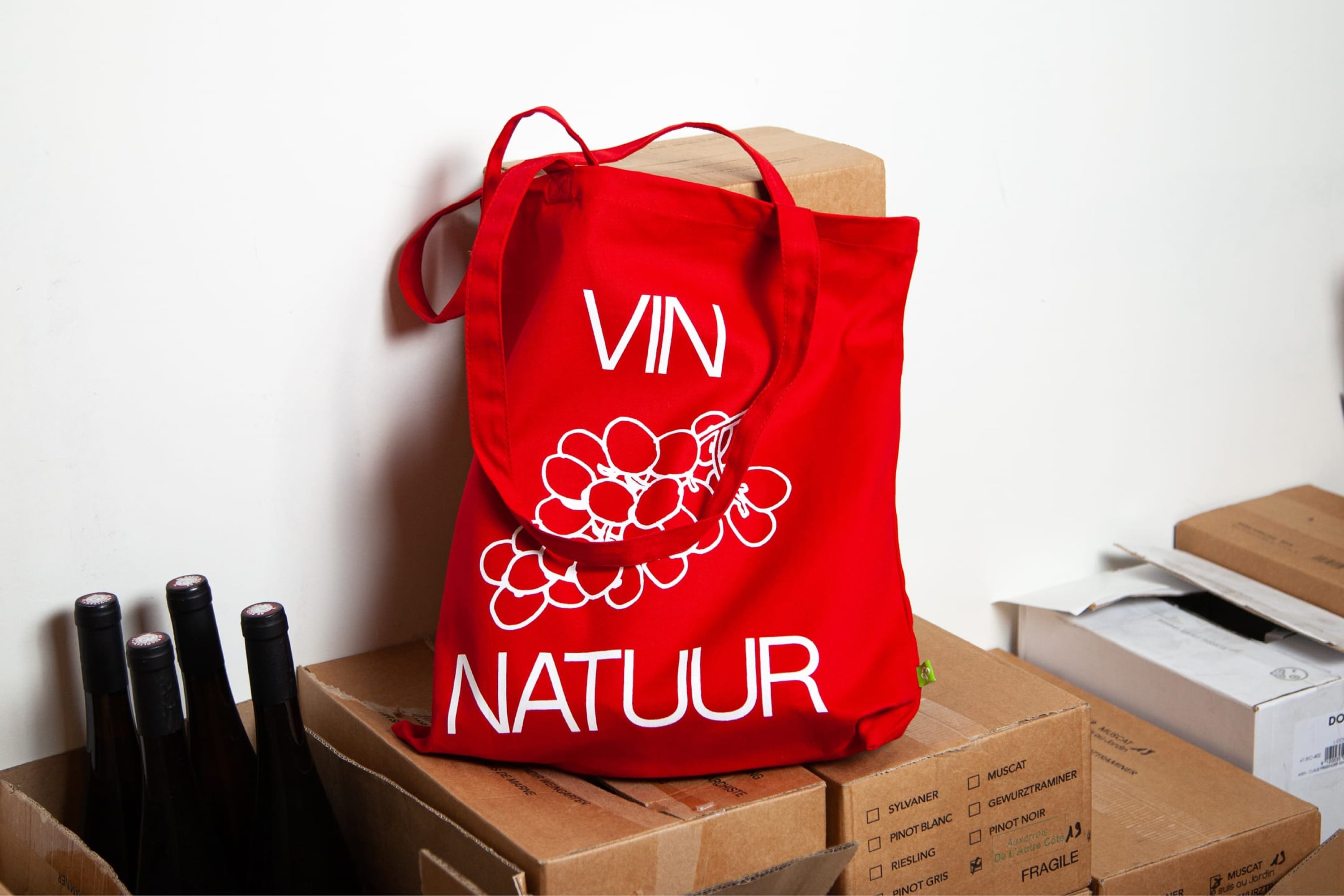
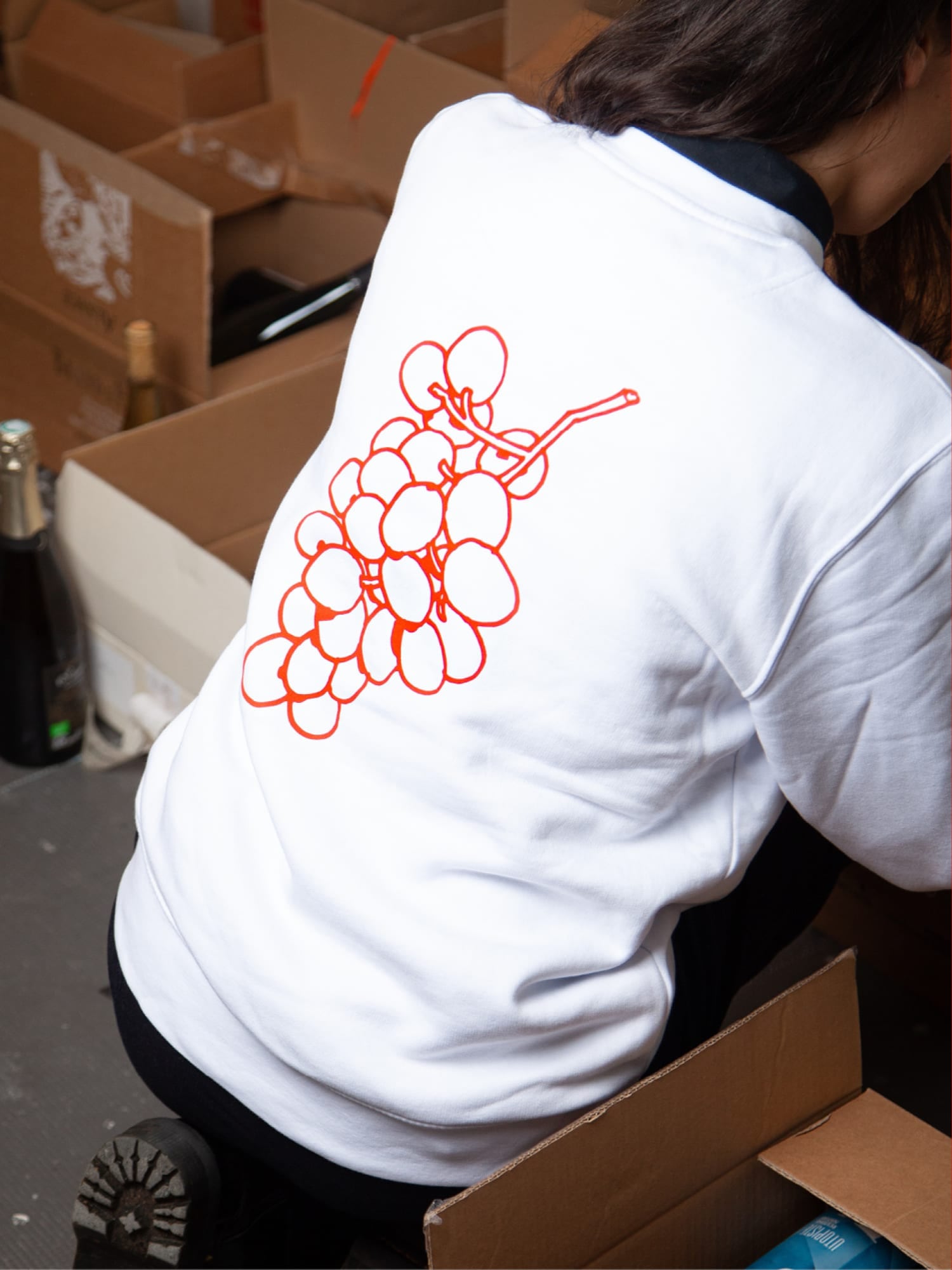
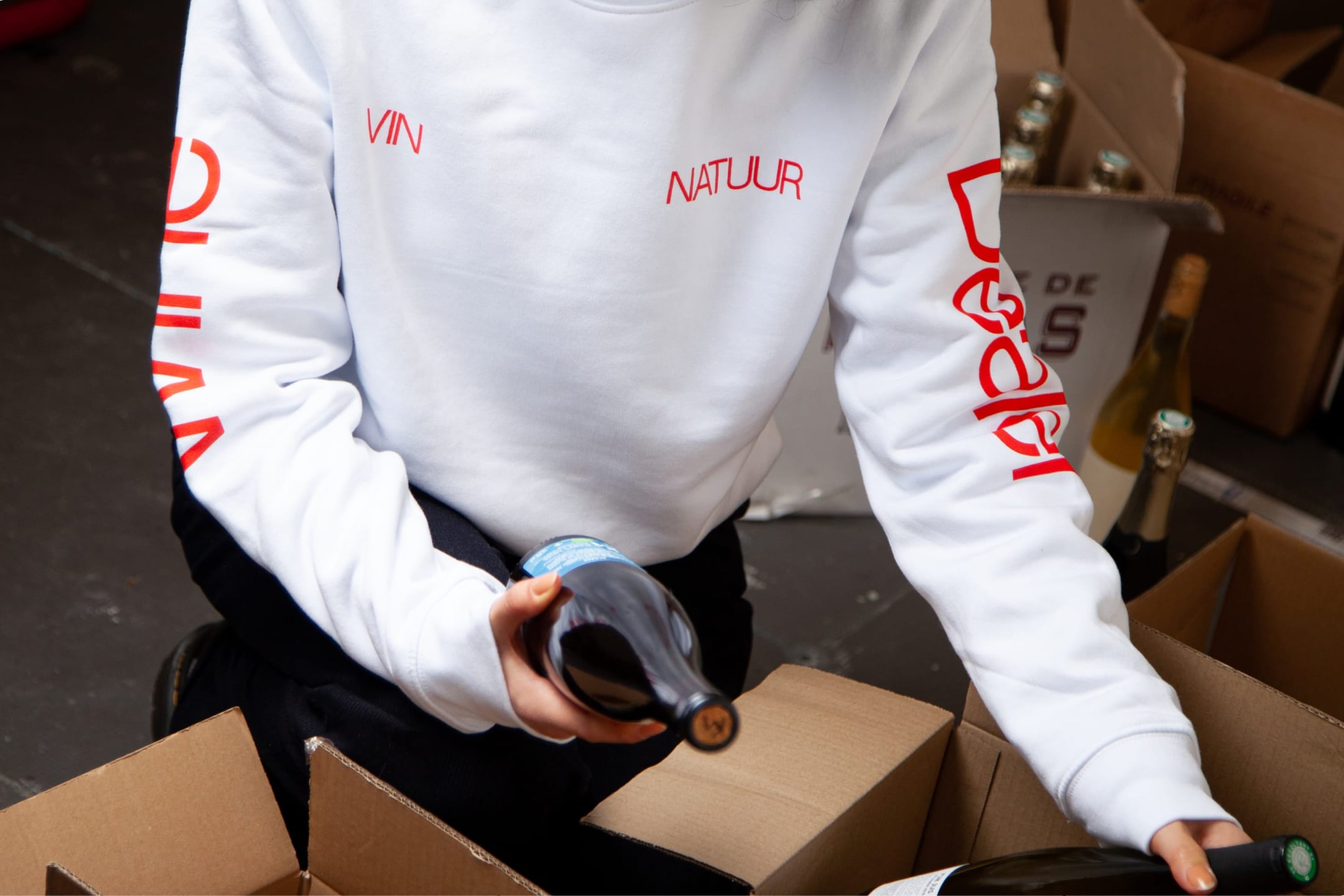
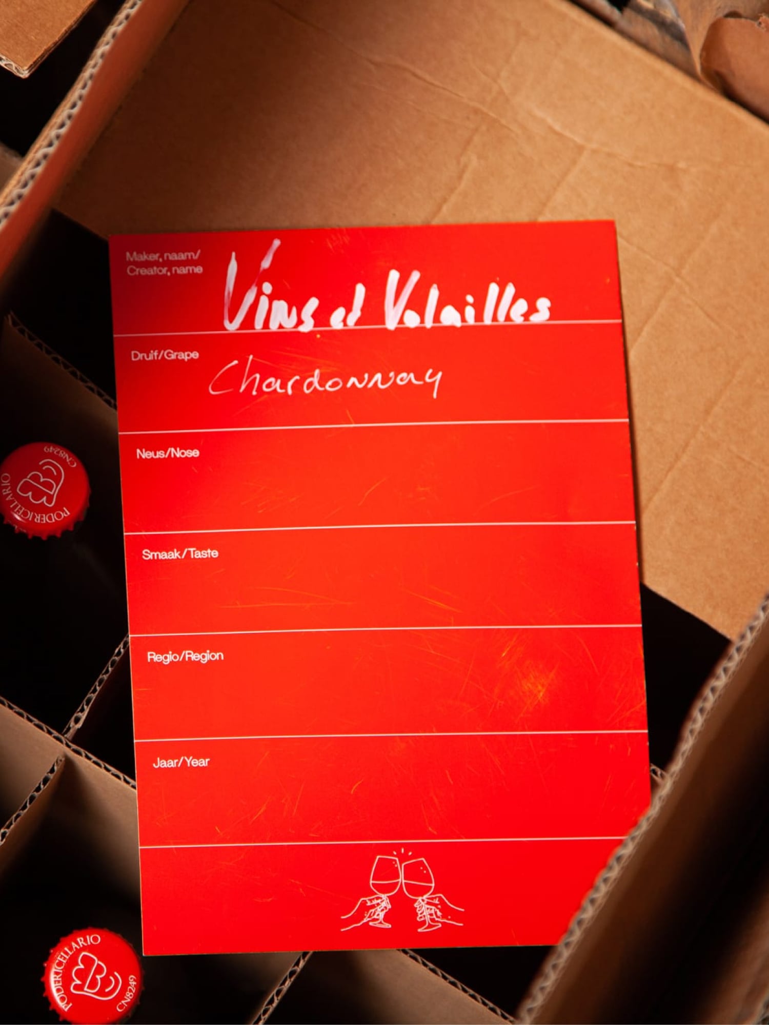
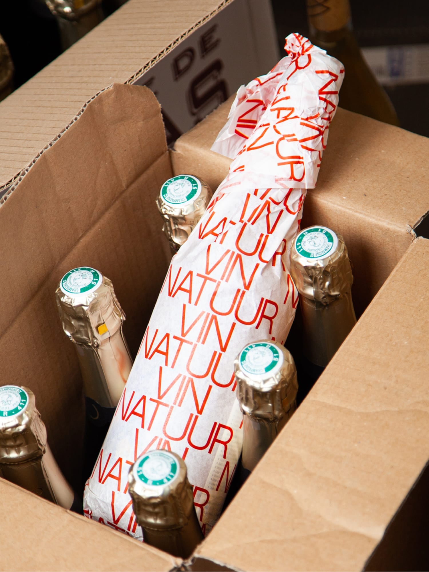
The graphic language and outspoken art direction are distinguished by its bright red color and the combination of bold typography with characterising illustrations. This reflects both the cleanliness of the natural vinification process as well as the outspoken character that natural wines tend to have.
My role
View
Hide
- Design and direction of creative concepts
- Presentation of the creative work to the internal team and client
- Onboarding and briefing of illustrator
- Development and delivery of the visual identity system and brandbook
Credits
View
Hide
Strategy and copywriting: Bram Steenhuis
Illustrations: Joost Stokhof
Case study production: Roos Alberts
Typeface: SM Maxéville by Soft Machine
Created at G2K
Vin Natuur
Natural wine dealer

Let’s create something great together!
Get in touch hey@gijs-lammers.com [copy]
© Gijs Lammers
Get in touch hey@gijs-lammers.com [copy]
© Gijs Lammers