-
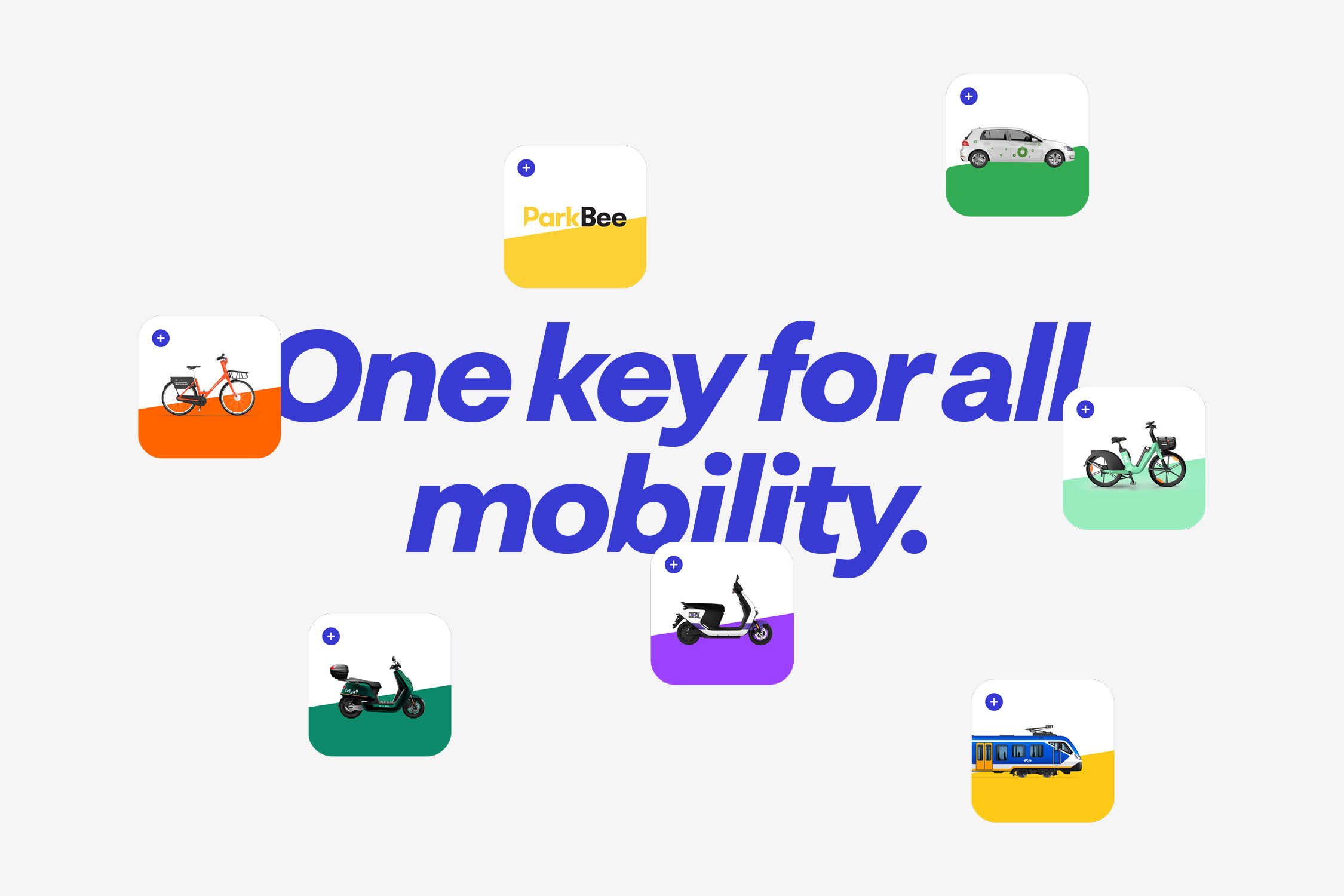
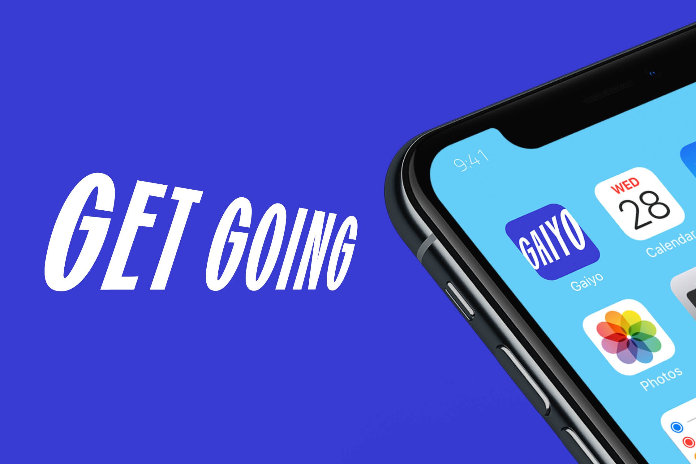
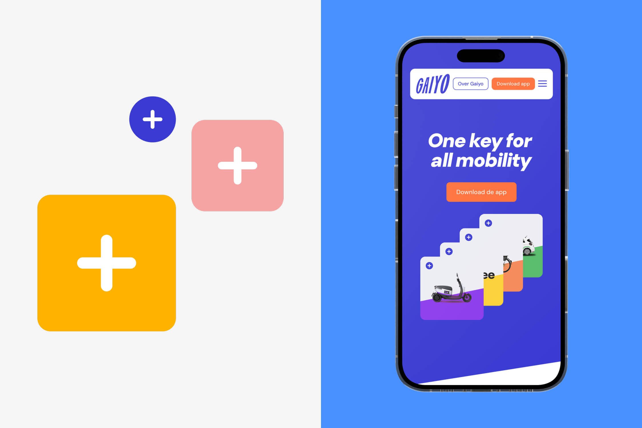
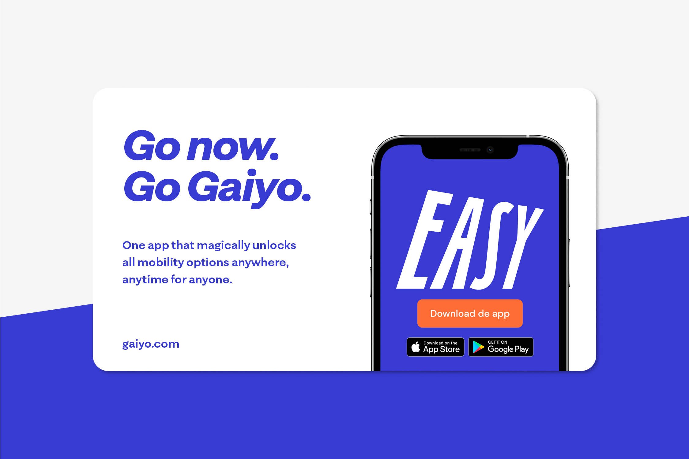
Gaiyo –meaning "overview" in Japanese– brings together all mobility options into one app. Hereby addressing the pressing needs of big and bustling urban centers. Gaiyo revolutionizes the way people navigate cities by creating a smarter, more conscious, and sustainable approach to mobility. No more juggling of multiple apps, but one key that gives you a comprehensive overview of all available sharing options, accessible anytime, anywhere and for anyone.
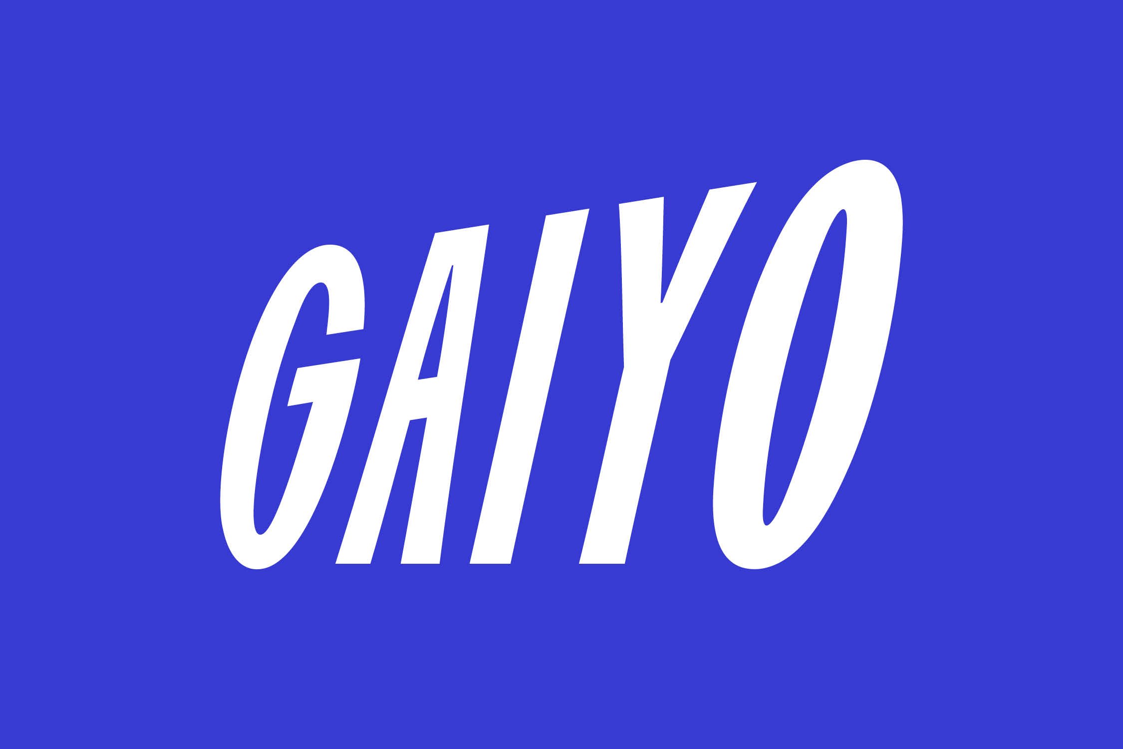
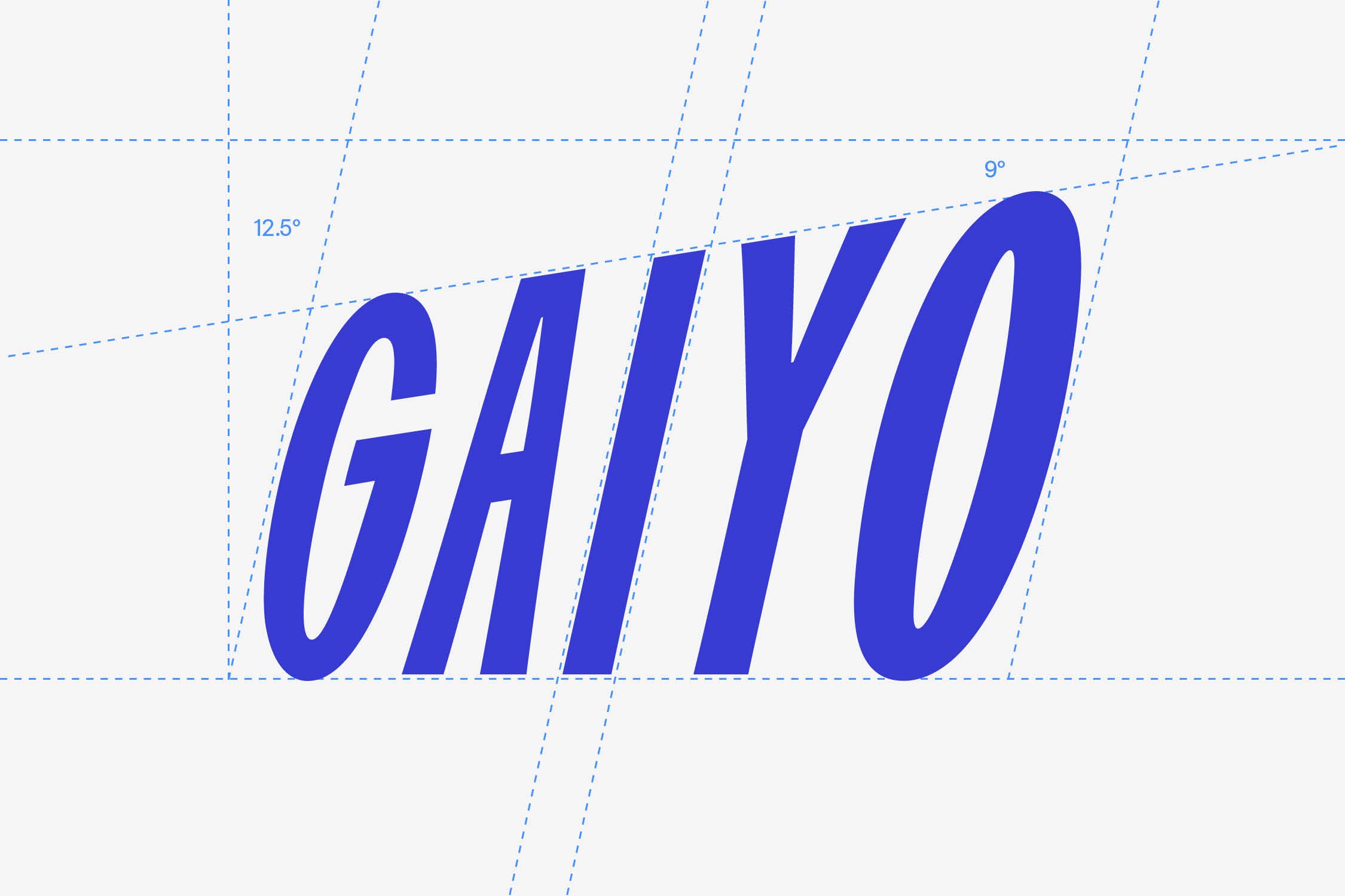
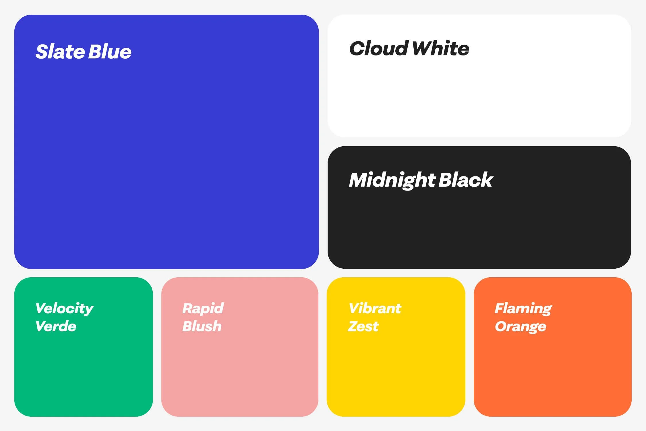
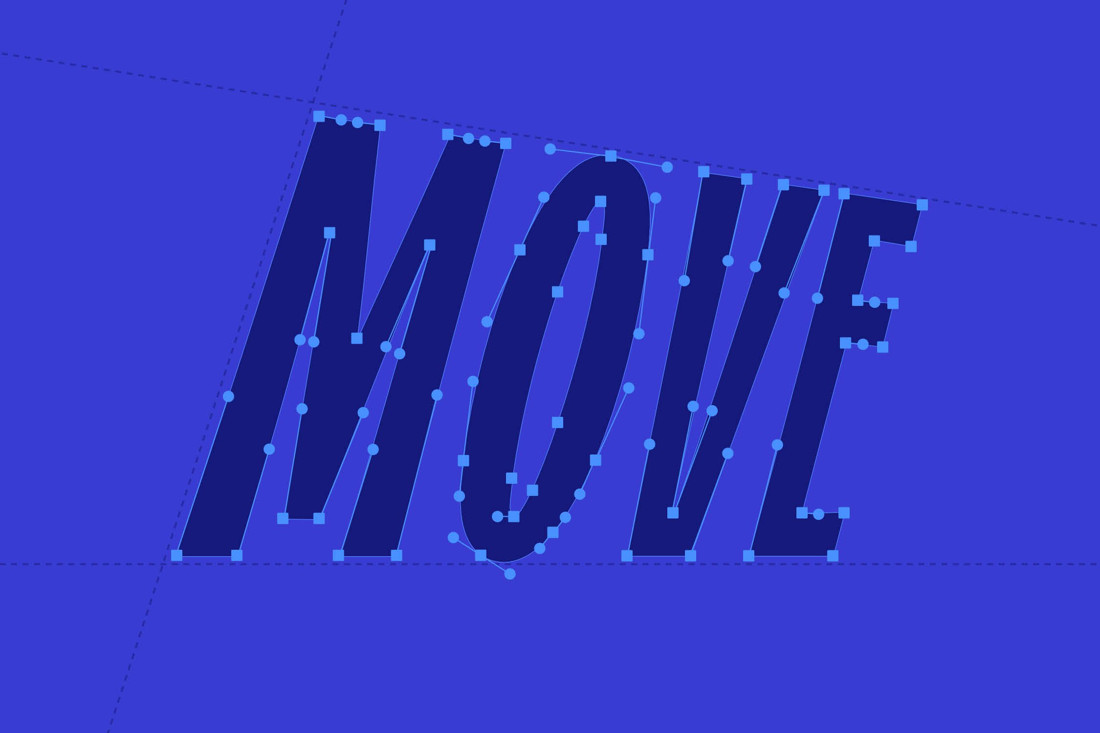
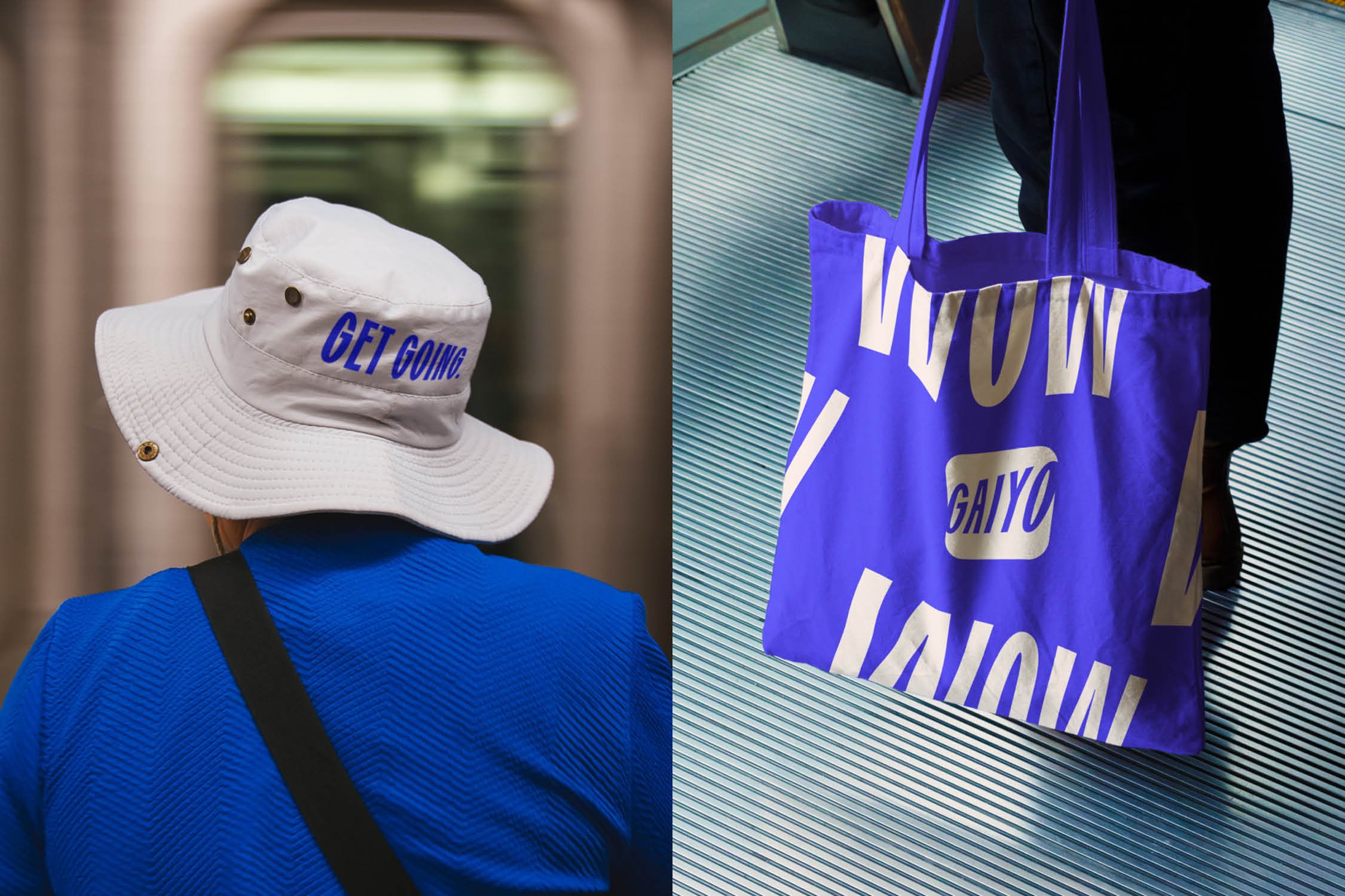
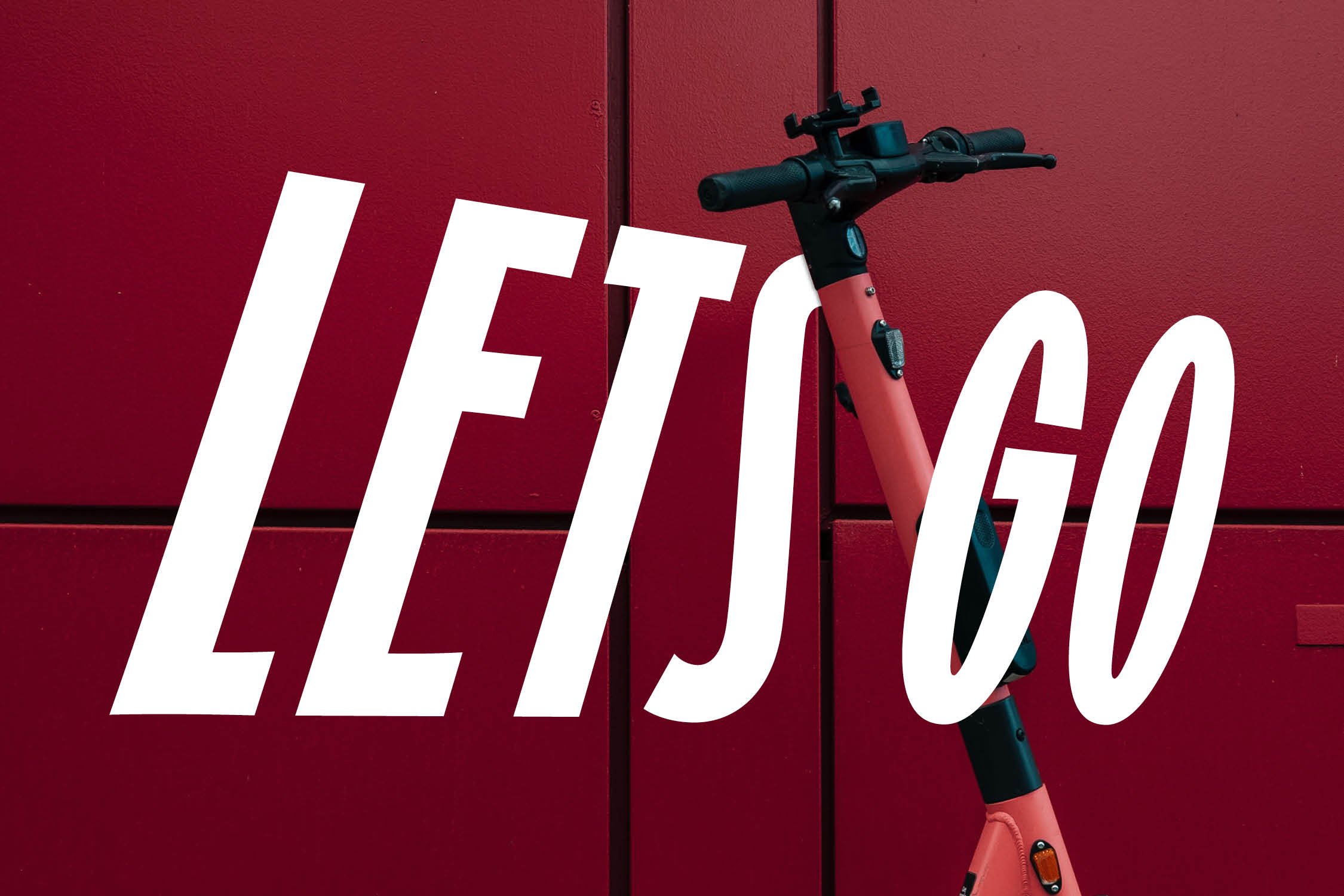
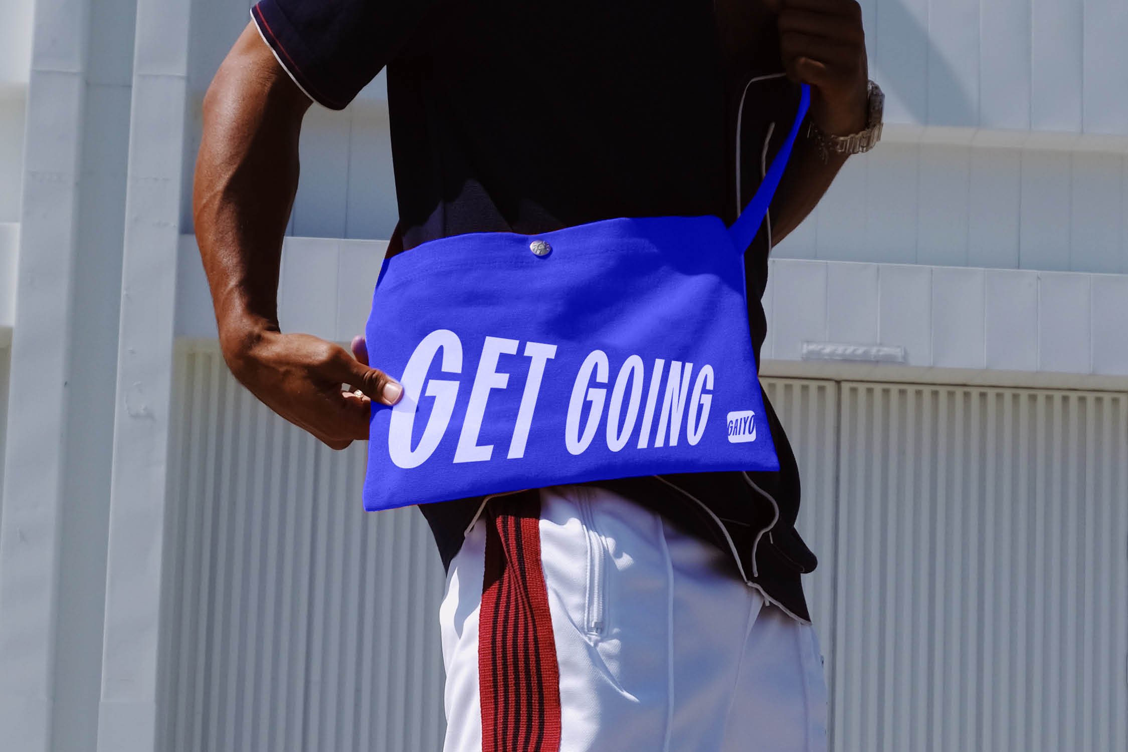
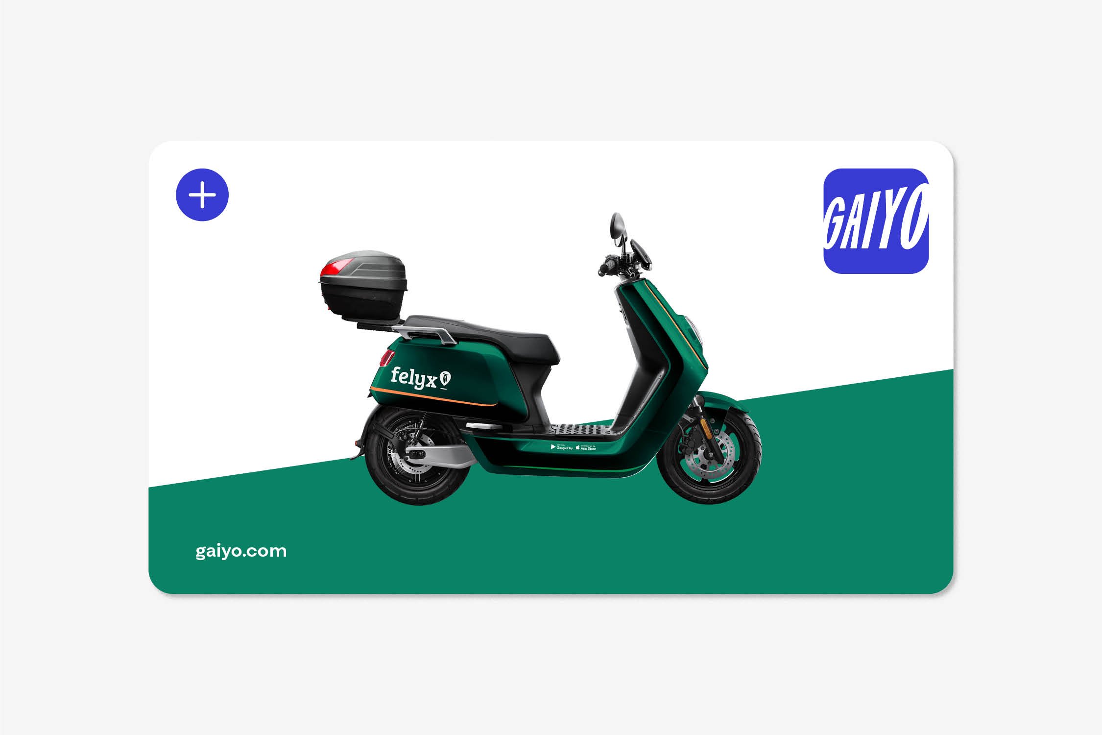
From shared cars to scooters, bicycles, buses, metros, and trains, Gaiyo's mission is to create "greener and cleaner cities" so users can move smarter and more swiftly to and through the city. This has shaped the visual identity by seamlessly fusing the concept of motion with an architectonic typography treatment. Creating a bold, energetic and outspoken look and feel. And because the logo is extending the edges, it imparts an infinite sensation. Symbolizing a forward movement toward the future, because with Gaiyo you can keep going forever.
With affiliated partners such as NS, Check, Bolt, Cargoroo and TIER, Gaiyo is the magic key to all-in-one mobility, where the brand builds on the philosophy of 'own nothing, but have it all'. In other words: Go green. Go clean. Go smart. Go fast. Go free. Go now. Go Gaiyo.
CLIENT
Gaiyo
SERVICES
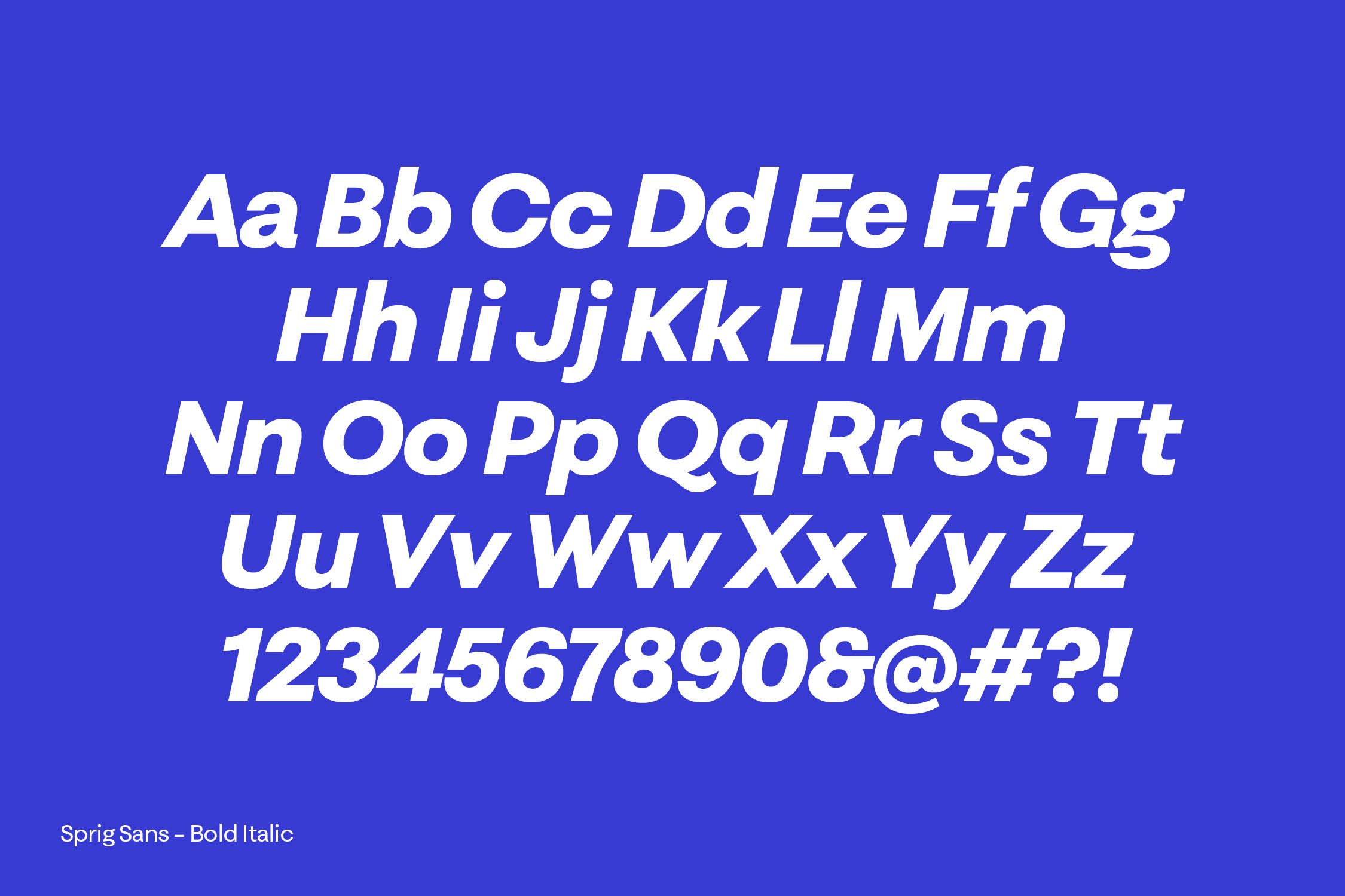
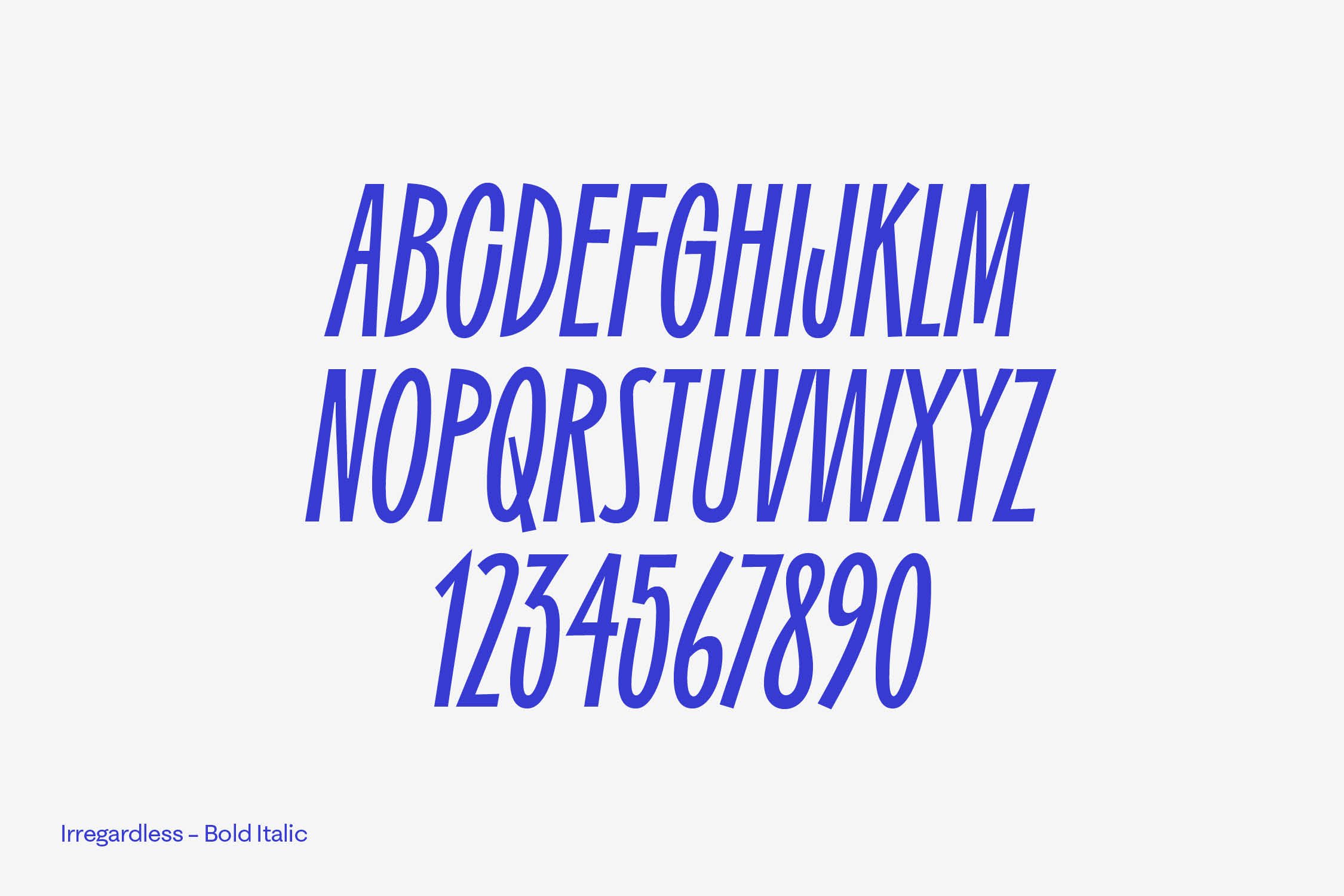
Rebranding, visual Identity, design system, art Direction, digital design
TEAM
Client — Gaiyo
Account — Noumy van Willigen, Irene Spronk, Nadine Marcar
Strategy — Liz van Houten, Pascal van Ham
Creation — Claire Ouwejan, Ferdy Joosen, Nikki de la Rambelje
Design — Gijs Lammers, Yasmine Bouma
Animation — STUDIO NORI, Marco Kruk
Music & SFX — Earforce, Thomas Wagenaar
Mediapartner — Zuiver Media, Dave Kroon
Created in collaboration with Gardeners